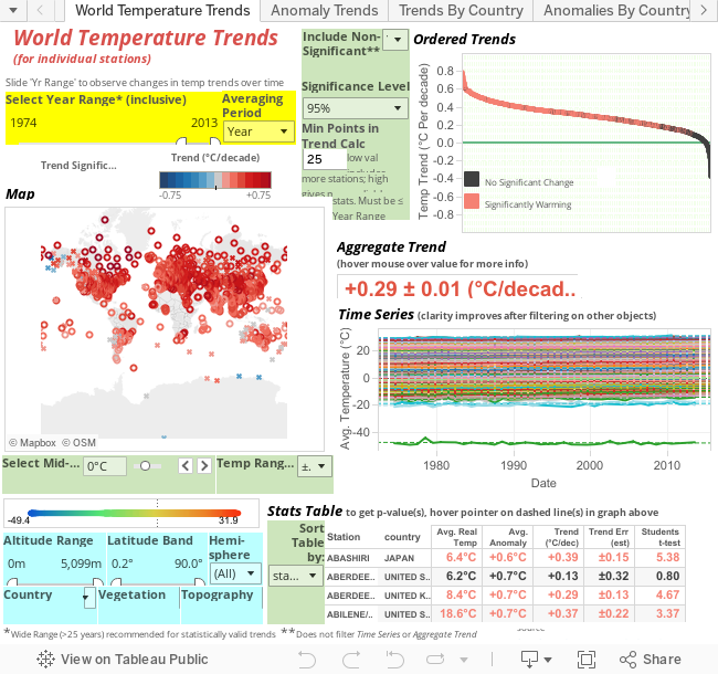
About the World Temperature Trends Viz
Using Filters
Suggested Views for World Temperature Trends
About Other Viz Tabs
What are Trends and Anomalies?
Note on Statistics
Data Source and Processing
About the World Temperature Trends Viz
- Each point on Map and Ordered Trends, line in Time Series or row in Stats Table, represents results from one temperature monitoring station (over 1000 in all)
- Information about the station, such as its location, is shown when the mouse is hovered over the point/line/row
- Results for each station focus on its Temperature Trend (see below). Trends are coloured redder (or bluer) on the Map plot according to the magnitude of the warming (or cooling) trend (note there are very few blue points in the default analysis period, 1974 - 2013)
- An Aggregate Trend value is shown in large text around the middle of the viz. This is a summary trend value for all (filtered) stations
- Time Series plots shows the annual temperature average for each station for each year over the course of the analysis period, though you have to view a filtered set of station(s) to see this clearly (see next point below). A dashed line represents the line-of-best fit through these points. It slopes up for any station that has a warming trend. The slope of this dashed line (hover over line and look at the first number in the equation) is the trend value (reported in °C/year, you have to x10 to get °C/decade). The Trend value for each station is also shown in the Stats Table and as part of the tooltip information box that appears when you hover over a point in either Map or Ordered Trends
- You can see the time series results for individual stations by clicking on a point/row in Map, Ordered Trends or Stats Table. This filters all other figures to report results for only that station. See Using Filters for more information
Using Filters
- There are two ways of filtering the set of stations shown on all plots and used in the aggregate trend calculation: 1) Dynamic Filters with Graphic Objects and 2) Selection Filters with Control Objects
- 1) Graph objects, such as Map and Ordered Trends, can be used as dynamic filters. Multiple stations can be selected by swiping (hold left mouse button while moving mouse to draw rectangle) over areas of the plot. Try this by swiping over top left corner of Ordered Trends to produce a subset of stations with the highest rates of warming. Swipe over North America on Map to further filter the set to North American stations with high rates of warming. You should see a reduced set of stations in Time Series (trend lines are noticeably sloping up) and in Stats Table. You can also select stations point-by-point (or row-by-row in stats table) by holding CTRL (or SHIFT for row ranges) while clicking.
- Dynamic Filters are a little tricky to remove when the viz is on an embedded web pages such as here. To remove a filter on Ordered Trends click on an area of whitespace within this object's boundary (just to right of its title is best). The page will be momentarily greyed-out and then returns to unfiltered state. Similarly, to remove a Map filter click just to right of the 'Map' title. If you wish to remove filters applied to first Ordered Trends and then to Map (as in example above) then you have to click near 'Map' title, wait for grey-out to disappear, click near 'Ordered Trends' title, then click near 'Map' title again. If the two filters were applied to Map first before Ordered Trends then click near 'Ordered Trends' title, wait for grey-out to disappear and map has zoomed back to full globe (takes a few seconds), click anywhere on white strips down either side of map, then near 'Map' title. No, I don't get it either but it works. If anyone finds a better way please let me know.
- 2) The other method of applying filters is through control objects such as lists and sliders (mostly light-blue boxes in bottom left). As with graph objects, they filter the set of stations shown on all plots and used in the aggregate trend calculation. There are no filters applied in the default setting since all items in each list are 'selected' and sliders are set to maximum range. As an example, view only the stations with altitude above around 2000m by sliding the left side of Altitude Range slider from '0' to around '2000' (you can set value precisely by clicking on the number). You should notice only stations in mountainous regions remain. This is a filtered set of stations. Slide slider back to '0' to view full set of (unfiltered) stations. Within lists (such as Country) you can make multiple selections by first unticking '(All)' and then ticking appropriate boxes. Click on '(All)' to return to unfiltered state. To remove the window list you must click back on that object's selection display box (either immediately under or over the list).
- The most interesting filter is that of temperature (just above light-blue boxes). By default it includes the full range of temperatures but if Temperature Range Width is lowered from ±60°C to ±2°C then you are only seeing stations with an average temperature between -2 and +2°C. Steadily increase the value of Select Mid-Point of Temp Range from 0 to successively higher values (by clicking on arrow or grabbing slider) to observe highlighted stations shift towards the equator on Map and a simultaneous decline in magnitude of aggregate warming trends.
Suggested Views for World Temperature Trends
- Default setting of last 40 years (1974-2013) shows the globe is completely dominated by warming trends. For a very large proportion of stations (840 out of 1071) the warming trend is statistically significant (at the default 95% level) and there is not one single station showing statistically significant cooling. The aggregate rate is +0.29°C/decade (centre box) and 9% of all stations have rates above 0.50°C/decade.
- Slide Year Range (yellow box) from '1974-2013' to '1935-1974' to see how much more 'balanced' temperature trends were back then. From the Ordered Trends graph you can see most trends were small (~93% were between -0.2 and + 0.2°C/decade) and not significantly cooling or warming. From the Map plot you can see patches of warming and cooling zones around the world in approximately equal proportion. The Aggregate Trend was very close to completely flat (-0.03°C/decade).
- Slide year range back further to '1901-1940' to observe what appears to be the 40 year period with the highest rate of warming since 1860 but before recent times. Here, the average trend was +0.15°C/decade, only about half the current warming rate.
- Change selections in 'Hemisphere' filter (light blue box) to show that current warming trends (1974-2013) are, on average, much greater in the northern hemisphere (+0.30°C/decade) than in the southern (+0.20°C/decade).
- Set Hemisphere to 'North' and latitude band to 23.4° to 90° to select the northern hemisphere temperate and arctic zone. Make filter selections in 'Averaging Period' (yellow box next to Year Range slider) to observe that, on average, spring is heating at a lower rate (0.27±0.02°C/decade) than autumn (0.32±0.01°C/decade), summer (0.31±0.01°C/decade) or winter (0.32±0.02°C/decade).
About Other Viz Tabs
- There are three other tabs in the Viz (Anomaly Trends, Trends By Country, and Anomalies by Country and Station) showing alternative ways of visualising climate change
- I will post some more information about them at another time but they are generally easier to follow than the main viz discussed above.
What are Trends and Anomalies?
- A Trend tells you how fast temperature is changing over the course of a selected time period, so is more a snapshot of what is/was happening in that period. An Anomaly tells you how much temperature has changed in a selected time period since another base period (1901 to 1950) and is therefore more of a historical comparison. An analogy for Trend is "between 2001 and 2004 Joe was saving an average of $15,000 p.a" while for Anomaly it would be "In 2002 Joe had increased his average bank balance by $70,000 above his average balance between 1990 and 1995 when he started saving"
- A Trend is the rate of change in temperature (in °C per decade) over the course of the analysis period. For example, the 0.29°C/decade trend for the 40 years between 1974 and 2013 means that, on average, temperatures have increased by 1.16°C (4 decades x 0.29°C/decade) from 1974 up to 2013. Note that it not simply a comparison of averages at the start and end, but rather a line-of-best fit through all points throughout the period.
- An Anomaly is the difference between a station measurement in a particular year (its Real temperature) and the average temperature for that station between 1901 and 1950 inclusive (the base period temperature). For example, if station X average temperature for summer between 1901 and 1950 was 17.1°C and the summer temperatures between 1980 and 1982 were 17.0°C, 17.2°C and 17.3°C, respectively then the summer anomalies for those years would be -0.1°C, +0.1°C and +0.2°C. A trend based on anomalies would find the slope of the line passing through these values. Trends calculated on multiple, rather than single, stations (such as in Aggregate Trend or Trend By Country ) have to use anomaly values so they can be combined. This combination often includes many thousands of data points from stations all around the world and so has a high degree of statistical certainty. The disadvantage though is that in order for a station to be part of an analysis it must have some measurements between 1901 and 1950 (the default here is at least 20 measurements to get an accurate base average). Many stations monitoring temperature now do not have this data and so must be excluded from aggregate calculations.
- The trends for single stations use real temperatures and do not need any comparison to a base period. However, there are certain minimum requirements for the number of points in a trend calculation (the default here is 25) so that the trend can be calculated accurately.
Note on Statistics
- The set of stations included in the average trend has increased and changed over time. To compare amongst the same set for two different periods, select all rows (hold Shift key while clicking on first and last rows) in Stats Table (sorted by station or by country) from Period 1, move year range slider to the Period 2, then slide back to Period 1. The filtered set should only include stations common to both periods.
- The software does not include an in-built function for estimating p-values (other than as a display for its own line-of-best fit calculations), so critical values are estimated at each significance level for each degree of freedom by a 2nd order exponential function. These estimates are used to calculate the error estimate for each trend value.
Source and Data Processing Notes
- Data for all viz's above was obtained from the National Climatic Center. The GHCN dataset was downloaded from ftp://ftp.ncdc.noaa.gov/pub/data/ghcn/v3/
- Monthly temperature average data and station meta-data was written to an MS Access database using VBA. Processing, including calculating season averages and renaming of duplicate station names, was performed using SQL
- A 'complete' seasonal temperature value for each station was calculated from three consecutive monthly values (eg average of Dec 1982, Jan 1983, Feb 1983 is the '1983 Winter' value (or Summer value if Southern Hemisphere)).If anything less than three monthly averages then season was regarded as 'incomplete' and not reported. Similarly, annual average values are only reported if all twelve months of data for a calender year were available
- Final data set included data from 1537 stations. This was the set limited to stations with at least 200 data points of complete seasonal data between 1950 and 2013 (256 seasons), or at least 300 complete seasonal data values in all history, if outside the United States. If in the US then the criteria was 240 points of complete seasonal data between 1950 and 2013, or 400 in all history.
No comments:
Post a Comment